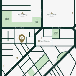

21 Harrington
Deliverables: Logo / Editoral Design / Print
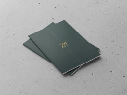
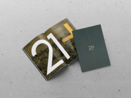
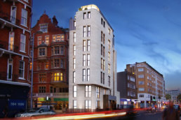
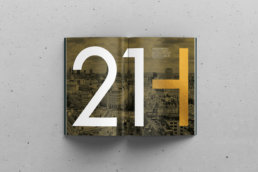
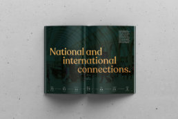
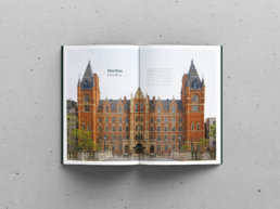
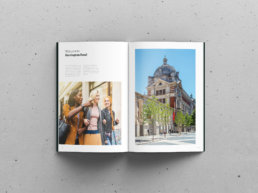
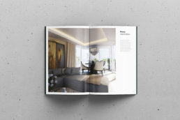
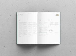
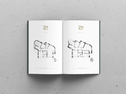
Nothing beats the feel of good quality texture on paper and a fresh smell of ink. This property brochure was commissioned on behalf of Urbanwise who specialise in property development in and around London. 21 Harrington was one of there latest developments which comprise of six beautiful contemporary apartments forming one of London’s most prestigious new addresses. As this was targeting a specific type of buyer, the brochure needed to ooze luxury and high quality. This was achieved by using metallic foils, premium paper for tactile and quality printing techniques.
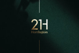
GF Smith colorplan racing green finished off with a metallic gold foil